A landing page that doesn’t convert isn’t a design problem — it’s usually a trust problem. In the IPTV reseller space specifically, visitors arrive with a specific level of skepticism. They’ve probably seen unreliable services before. They’re evaluating whether you’re another generic reseller or someone who knows what they’re doing. Every design decision on your page either builds that trust or erodes it.
This guide covers what high-converting pages in this niche actually look like, how the management infrastructure connects to your page design decisions, and the specific mistakes that tank conversion rates before a visitor even reads your offer.
Before getting into it: this platform provides subscription management software only. It does not host television channels, stream media content, or distribute copyrighted material. The landing page guidance here is for promoting your reseller management service — not for advertising specific content channels.
Why Most IPTV Landing Pages Fail Before Anyone Reads Them
Page speed is the first filter. If your landing page takes more than two seconds to load on mobile, a significant percentage of visitors leave before they see anything. This isn’t a design issue — it’s a hosting and build issue. A page built on a bloated WordPress theme with unoptimized images will fail this test regardless of how well the copy is written.
Test your page speed honestly using Google PageSpeed Insights before investing any time in copy or design optimization. If mobile speed is below 70, fix the technical performance first. Everything else is secondary.
The second filter is visual credibility. Visitors form a trust judgment within seconds of landing on a page. A page that looks generic — stock photos of people watching TV, bright orange “SIGN UP NOW” buttons, no specific claims — signals that there’s nothing differentiated about what you’re offering. Visitors in this market have seen dozens of pages that look exactly like that.
What creates instant credibility: specific claims (not “best quality” but “99.4% uptime in our last 30 days”), visible social proof, and a professional structure that demonstrates you understand the product you’re selling.
Page Structure That Converts: The Logical Flow
Visitors don’t read landing pages linearly. They scan. They jump to pricing. They look for reasons to trust or distrust. Your page structure needs to work for scanning visitors, not just sequential readers.
The structure that performs consistently in this niche:
Above the fold: Your core value proposition in one clear headline, one supporting subheadline, and a primary CTA button. No navigation menu. No distractions. The visitor’s first decision should be: do I want to know more or not?
Headline framing that converts: specific outcomes over vague claims. “Start your IPTV reseller business today with a panel that manages itself” outperforms “The Best IPTV Management Platform.” One is specific, the other is a claim every competitor makes.
Social proof block: Immediately below the fold. Customer quotes with specific details (“I went from manually tracking 20 accounts in a spreadsheet to managing 200 through the panel with 30 minutes of work per week”), trust indicators, and if available, usage numbers. Generic “satisfied customers” testimonials don’t move conversion. Specific, outcome-focused testimonials do.
Features explained as benefits: Not “advanced analytics dashboard” — but “know which of your subscribers are about to churn before they cancel.” Each feature description should answer the visitor’s unspoken question: “What does this mean for me?”
Pricing table: More on this below. It belongs about two-thirds of the way down the page, after you’ve established value, not at the top.
FAQ: Addresses the specific objections your audience has before they contact you. In this niche: questions about device compatibility, setup difficulty, legal positioning, and what happens when something doesn’t work.
Final CTA: Repeat of the primary CTA with urgency framing if appropriate.
The Pricing Table: Where Most Reseller Pages Lose the Sale
Pricing tables are the most A/B-tested element on conversion-focused pages, and most IPTV reseller pricing tables make the same mistakes.
Mistake 1: Too many options. Three plan tiers is optimal. More than three creates decision paralysis. When visitors can’t quickly identify which plan is right for them, they leave without buying.
Mistake 2: No visual hierarchy. One plan should be visually prominent — typically the middle tier. This is the anchor that makes the other two feel like clear choices (one too basic, one more than needed). If all three plans look equally prominent, the visual hierarchy isn’t doing its job.
Mistake 3: Feature lists without context. “Unlimited users,” “API access,” “real-time analytics” — these mean nothing to a visitor who hasn’t used a reseller panel before. Translate features into operational outcomes. “Unlimited users — grow your subscriber base without hitting a ceiling” takes five more words and dramatically improves comprehension.
Mistake 4: Complex checkout. Every additional step between “click buy” and “account created” drops conversion. The ideal checkout flow: select plan → payment details → confirmation. If your checkout requires account creation, email verification, and additional form fields before payment, you’re losing sales at each step.
Connecting Your Page to the Management Panel
The connection between your landing page and the reseller panel is where the operational design matters most, and it’s what separates professional reseller operations from hobbyist ones.
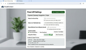
When a visitor converts to a paying subscriber, what happens next should be automatic. Using API integration between your payment system and your reseller panel, account creation triggers within seconds of payment confirmation. The subscriber receives credentials within a minute of paying.
That immediate delivery creates a specific psychological impression: this is a professional operation. Waiting hours for manually-created credentials creates the opposite impression, especially for a customer’s first interaction with your service.
The account creation workflow inside the panel takes about 90 seconds when done manually in the User Management tab. With API automation, it’s triggered without any manual action. Configure this connection before you start marketing your page — the first impression of your service delivery determines whether that subscriber renews.
The analytics section in your panel also provides data directly relevant to landing page optimization:
- Device type breakdown tells you whether to prioritize mobile or desktop page design (most IPTV reseller audiences are predominantly mobile — but verify with your own data)
- Geographic distribution of subscribers tells you whether your page should be optimized for UK, US, or European visitor behavior
- Plan type distribution shows whether your pricing table is successfully directing visitors toward your preferred plan tier
Check these analytics monthly and use them to inform specific page changes rather than making design decisions on intuition alone.
Mobile-First Design: Non-Negotiable in This Market
The majority of visitors to IPTV reseller landing pages are on mobile devices. This isn’t a general statement — it’s verified by the analytics of operations serving UK, USA, and EU audiences consistently. If your page was designed primarily for desktop and mobile is an afterthought, you’re optimizing for the minority of your traffic.
Mobile-first design isn’t just about making the desktop version responsive. It means:
- CTA buttons large enough to tap easily without zooming (minimum 44px height)
- Text readable without pinching (minimum 16px body text)
- Pricing table that works in vertical scroll rather than horizontal comparison layout
- Images that load quickly on mobile connections — compressed, correctly sized, lazy-loaded
- Form fields that trigger the correct keyboard type on mobile (email field should trigger email keyboard, number field should trigger numeric keypad)
The friction of a poorly mobile-optimized checkout page loses sales that your marketing already paid for. Most visitors won’t report this problem — they’ll just leave.
Sales Funnel Structure: From Traffic to Subscriber
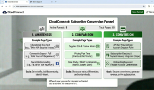
A sale almost never happens on the first visit in this niche. Understanding the typical conversion path helps you design pages for where visitors actually are in their decision process, not where you’d like them to be.
First visit (awareness/research): Visitor is evaluating whether IPTV reselling is a viable business or whether to switch from their current service. They want information, not a hard sell. Pages targeting this stage should provide education and capture an email address or Telegram contact in exchange for a useful resource — a setup guide, a pricing comparison, a business model breakdown.
Second to third visit (comparison): Visitor is now comparing options. They want to see pricing, understand what differentiates your service, and look for trust signals. Your pricing page and testimonials matter most here.
Decision visit (conversion): Visitor is ready to buy. Friction in the checkout process is the primary risk at this stage. Everything should be optimized for speed and ease.
Most reseller landing pages are built for the decision visit only. They present pricing and CTAs to visitors who aren’t ready to buy yet. Building content and lead capture for earlier funnel stages dramatically improves overall conversion rate because you’re nurturing visitors through the process rather than hoping they convert on the first visit.
What Most CRO Guides Don’t Tell You About This Niche
Trust Signals Specific to IPTV Matter More Than Generic Ones
Generic trust signals — padlock icons, “secure checkout” badges, generic five-star review widgets — don’t move conversion in this market the way they do in e-commerce. Your visitors have specific concerns: will the service work on their devices, will it be reliable, and what happens when something goes wrong.
Trust signals that actually work here:
- Specific uptime claims with timeframes (“99.2% uptime in March 2026”)
- Device compatibility confirmations with actual device names (“works on Firestick 4K, Samsung Smart TV, iPhone, Android — all confirmed tested”)
- Clear statement of your support availability and response time
- Transparent legal positioning — a clear statement that you provide subscription management software, not content distribution
That last point deserves special attention. Visitors who are evaluating IPTV services have encountered plenty of operators who are vague about what they’re actually selling. A transparent statement of your legal role — that you provide management tools, not content — actually improves conversion with serious buyers who want to operate legitimately. Don’t bury it or avoid it.
Page Speed Optimization Is a Weekly Task, Not a One-Time Fix
Pages degrade over time. New plugins, additional tracking scripts, larger images uploaded without compression — these accumulate and slow down load times without any single change being noticeable. Check PageSpeed Insights monthly at minimum. A page that scored 82 on mobile in January might score 67 in April after incremental additions.
Your FAQ Reduces Inbound Support Volume Significantly
A well-crafted FAQ on your landing page isn’t just a conversion tool — it’s a support volume reduction tool. Every question answered on the page is a question that doesn’t arrive in your inbox from a prospect or new subscriber. Identify your five most frequently asked pre-sale questions (typically: device compatibility, setup process, legal positioning, cancellation policy, trial availability) and answer them clearly on the page.
Long-Form Pages Convert Better Than Short Ones in This Niche
The instinct to “keep it short” is wrong for IPTV reseller pages. Visitors who are making a purchase decision involving a recurring subscription want information. Short pages feel evasive. Long pages that answer questions thoroughly, demonstrate genuine knowledge, and build trust through detail consistently outperform short pages in this category. The goal isn’t brevity — it’s covering everything a serious buyer needs to know to feel confident making a decision.
Real Mistakes That Hurt Conversion Rates
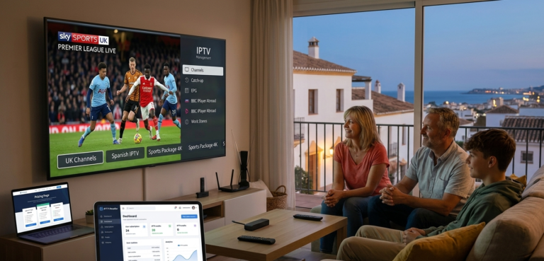
Mistake 1: Generic hero section with no specific claims. A landing page that opened with “The Best IPTV Service — Subscribe Today” and a stock photo of a family watching TV generated minimal conversions from paid traffic. The page said nothing differentiating. Fix: Replaced with a specific headline addressing the visitor’s actual goal (“Manage your IPTV reseller business from one dashboard — automated billing, instant account creation, real-time analytics”), a specific uptime claim, and an image of the actual dashboard rather than a stock photo.
Mistake 2: Three-step checkout that required account creation before payment. Visitors were dropping off at the account creation step despite reaching the checkout page. Fix: Restructured checkout to payment-first, account creation after confirmation. Conversion at checkout improved significantly.
Mistake 3: Pricing table with equal visual weight on all three plans. Visitors couldn’t quickly identify which plan to choose and left without deciding. Fix: Redesigned to visually emphasize the middle tier with a “Most Popular” label, contrasting button color, and slightly larger card. Average order value increased as more visitors selected the middle tier over the entry-level option.
Mistake 4: No mobile-specific CTA placement. On mobile, the primary CTA button was below a long hero section, requiring scrolling before any action prompt appeared. Fix: Added a sticky CTA bar at the bottom of the mobile view that follows the visitor as they scroll. Mobile conversion rate improved measurably.
Mistake 5: Testimonials without specific outcomes. “Great service, very reliable!” — five stars. Generic, unverifiable, ignored by serious buyers. Fix: Replaced with testimonials that included specific operational details. “Switched from manual spreadsheet tracking of 35 accounts to managing 180 through the panel. Renewal reminders run automatically now — I check the dashboard twice a week instead of every day.”
Technical Setup: IPTV Website Builder vs. Custom Build
There are three realistic options for building your landing page in 2026:
WordPress with a landing page builder (Elementor, Divi) — most flexible, most customizable, requires hosting management. Performance depends heavily on hosting quality and plugin discipline. Common issue: plugin bloat slowing mobile load times.
Dedicated landing page platforms (Unbounce, Leadpages, Instapage) — faster to build, optimized for conversion, less customizable. Better mobile performance out of the box than most WordPress builds. Higher monthly cost.
Custom HTML/CSS — fastest load times, maximum control, requires development skill or budget. Best option for performance if you have the technical capability.
The choice matters less than execution quality. A well-optimized WordPress page outperforms a poorly configured dedicated landing page platform. Focus on the fundamentals: speed, mobile responsiveness, clear hierarchy, and trust signals — regardless of which tool you use to build.
The Conversion Workflow End-to-End
| Stage | Visitor Action | Your System | Time | Outcome |
|---|---|---|---|---|
| 1 | Visitor arrives | Landing page loads | <2 sec | First impression formed |
| 2 | Visitor scans page | Social proof, pricing visible | ~30 sec | Trust decision made |
| 3 | Visitor clicks CTA | Pricing page or trial CTA | ~5 sec | Commitment step begins |
| 4 | Visitor selects plan | Pricing table | ~1 min | Plan chosen |
| 5 | Visitor pays | Payment gateway | ~2 min | Payment confirmed |
| 6 | API triggers account creation | Reseller panel User Management | ~30 sec | Account generated |
| 7 | Subscriber receives credentials | Automated email/message | ~60 sec | Onboarding begins |
| 8 | Setup guide delivered | CRM / email sequence | ~2 min | First use supported |
Total time from payment to credentials in subscriber’s hands: under two minutes with proper automation configured. That response speed is itself a conversion asset — mention it on your landing page. “Credentials delivered within 60 seconds of payment” is a specific, credible claim that differentiates you from operators who manually create accounts.
FAQ
How fast does my landing page actually need to load? Under two seconds on mobile is the target. Below three seconds is acceptable. Above three seconds and you’re losing a meaningful percentage of visitors before they see your offer. Test using Google PageSpeed Insights and GTmetrix from a location that matches your primary audience’s geography — server location affects load time for international visitors.
Where should the pricing table appear on the page? About two-thirds of the way down, after you’ve established what you offer and why it’s trustworthy. Visitors who see pricing before they understand the value proposition make decisions based purely on price. Visitors who see pricing after understanding the offer evaluate it in context. The second scenario converts at a higher average order value.
How many testimonials do I need? Three to five specific, outcome-focused testimonials is sufficient. More doesn’t necessarily help — quality matters more than quantity. One testimonial with specific numbers and outcomes outperforms five generic “great service” quotes.
Should I offer a free trial from the landing page? Yes, with a clear and visible structure. Bury the trial offer or make it hard to find and visitors assume it doesn’t exist. Feature it clearly but position it as a path to purchase, not an alternative to purchasing. “Try free for 24 hours — most users subscribe within the first session” frames it as a conversion step rather than an indefinite free option.
What’s the most important single change I can make to improve conversion? If you can only change one thing, improve your hero section headline. It’s the first thing every visitor reads and the fastest way to either capture or lose attention. A specific, outcome-focused headline that speaks to what the visitor actually wants will improve conversion more than any design or color change.
How do I know if my page is actually converting well? Install Google Analytics (or an equivalent) and track conversion events — specifically, completions of your checkout process. A conversion rate of 2–4% from cold traffic is reasonable for this niche. Above 5% from cold traffic suggests strong page-market fit. Below 1% suggests a fundamental problem in either targeting, messaging, or page experience that needs diagnosing before increasing traffic.
Should I have different landing pages for different markets (UK vs. USA)? At scale, yes. Different markets have different trust signals, price expectations, and colloquial language. A page built for UK visitors can feel slightly off to US visitors and vice versa. At the beginning, a single well-optimized page is fine. Once you have enough traffic data to see meaningful behavioral differences between geographic segments, market-specific pages become worth the additional effort.
Landing page design isn’t a one-time project — it’s an ongoing testing and optimization process. The page you launch should be your best current hypothesis about what converts your specific audience. The analytics from that page, combined with the subscriber data in your management panel, should continuously inform improvements. The resellers who build the most effective pages are the ones who treat every version as a test rather than a finished product.